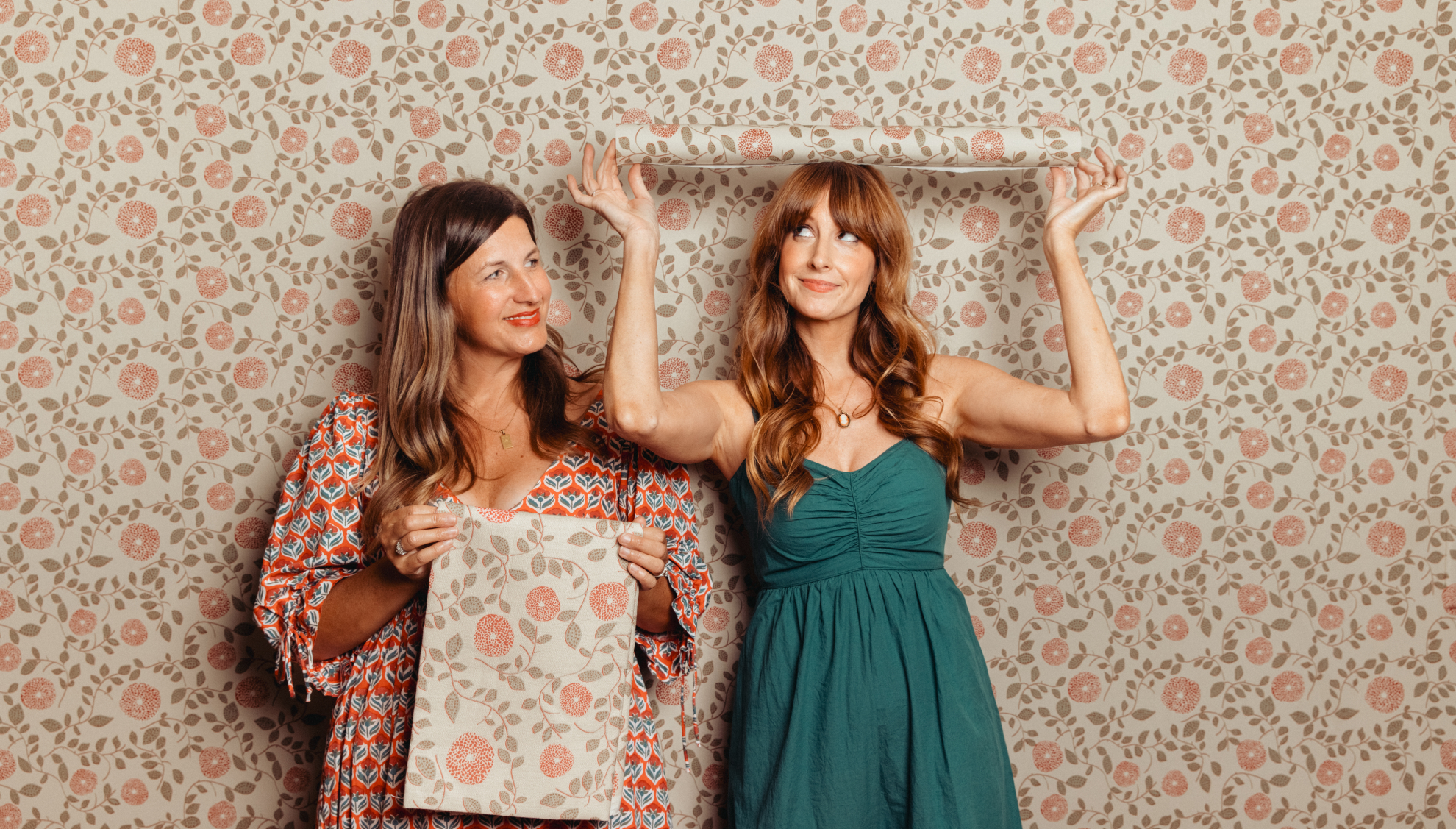
At Milton & King, we believe wallpaper is more than a decorative choice—it’s a reflection of personality, creativity, and joy. Few people embody that philosophy more than the creative powerhouse duo, Chelcie Eastman and Gray Benko.
Together, Gray and Chelcie have built a loyal following of design lovers who aren’t afraid to embrace character, charm, and a little fun. Their vibrant approach to interiors—and their fearless use of bold colour and pattern—has captured audiences not only through their growing design brand, but also on their hit television series Happy to Be Home. What started as a shared passion for artistry and self-expression has evolved into a distinctive design aesthetic known for joyful spaces that feel unapologetically personal. Now, their beloved wallpaper collection is available globally through Milton & King, bringing their most recognisable patterns to a new audience and offering a fresh way to create interiors filled with personality and heart.
We caught up with Gray and Chelcie to discuss their journey, the inspiration behind the ‘Happy to Be Home‘ TV series, and how they hope their collection empowers others to design their spaces that feel joyful, unique, and entirely their own.
1. For those discovering your work for the first time, how would you each describe your style in three words?
Gray: I feel like mine would be eclectic, whimsical and quirky.
Chelcie: I would say the only other word that I would add to that is personal.
2. Where do you both go to find inspiration, whether in interiors, fashion, or everyday life?
Gray: I feel I find inspiration everywhere, whether I’m outside in nature or I’m flipping through a magazine or watching a movie like… I’m a Wes Anderson fan. I feel like I soak it up everywhere without even realizing it is happening.
Chelcie: Have you ever worked with somebody that you know is special? There are some people in life and you say, wait they are different. I think Gray’s brain is wired differently than most other people’s brains in the entire world. And she looks through her eyes in a way that most people don’t. She’s my inspiration when it comes to the designs.
3. When designing a home, what comes first—the colour palette, the furniture, or the feeling?
Chelcie: That’s a great question. For me, it’s the function of the space. What does that space need to be for the homeowner? What are they going to use it for? So for kitchens, I would say that’s layout, cabinetry, and usability. For living room spaces, dining rooms, kitchens…what are the functions of that room? And I would do the space layout. Where is the sofa going? Which room needs a faucet? Are we doing wall mounts? Are we doing cabinetry? Where is the cooking triangle? How do we make this a functional space for the customer to live in?
Gray: for me the order would be…I start with the feeling. The feeling then informs the color palette, and then the color palette informs the furniture.
4. Your style feels both curated and approachable. How do you balance that?
Gray: For me, yes, you can have a few high end things and high end fabrics and things like that. I like to sprinkle in the antiques and the weird things and I think that is what helps the space feel more approachable.
Chelcie: One of the things we love about homes is that they reflect you. So we try really hard to put your collections into the design and try really hard to make it so that your house doesn’t feel like it wasn’t something purchased out of a showroom. It is something that explains who you are as a human, as a person. It shows your interests, it shows your hobbies and the things you love. The art itself is a reflection of things that make you happy.
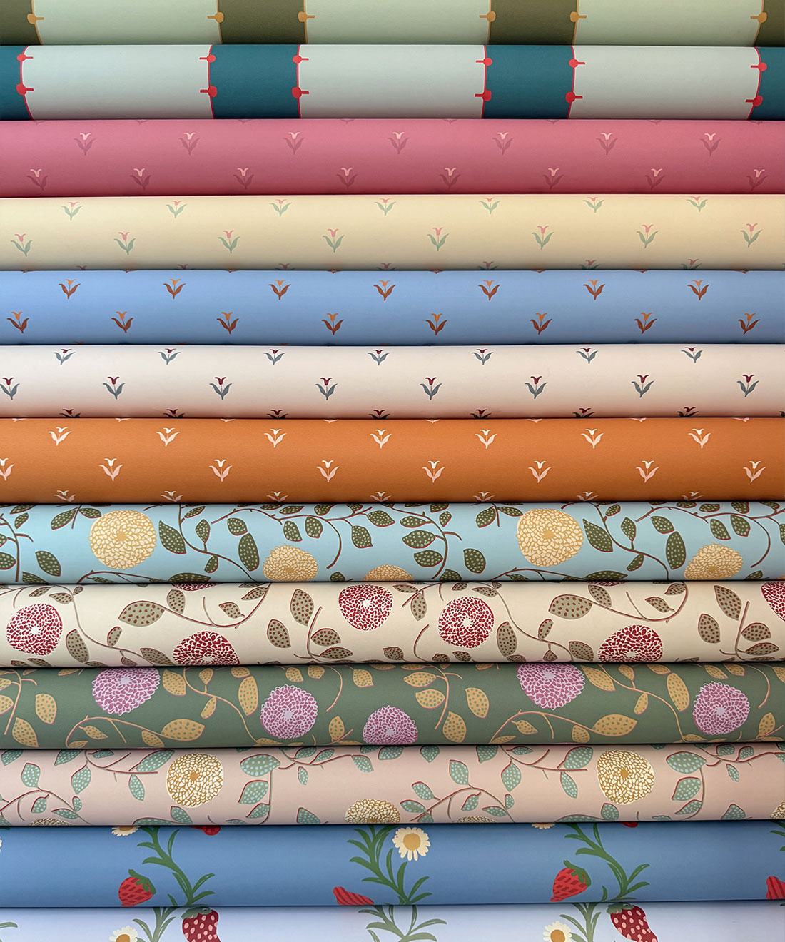
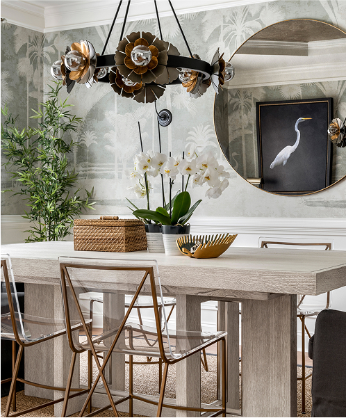
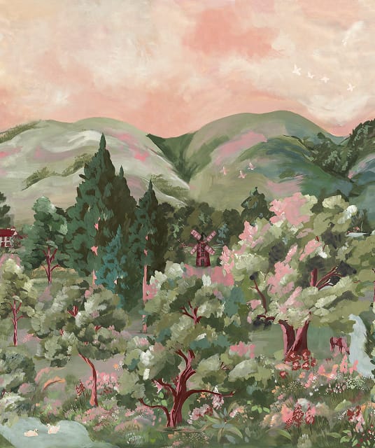
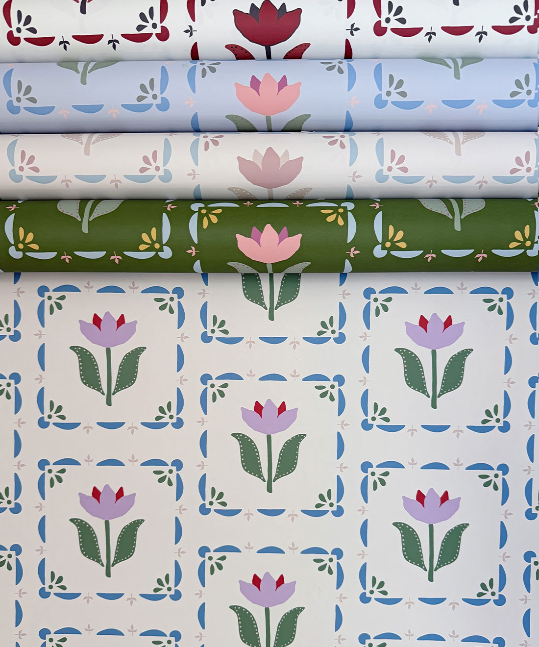
Gray Benko’s Anything But Basic Collection photo courtesy of Gray Benko
5. Happy to Be Home really shows how much personality you bring to every space—what’s your advice for someone hesitant to embrace colour.
Gray: So I would say, number one, something we say all the time is that it’s just paint, if you decide you hate it, you can change it later. But even with paint, if you’re not ready to go all in, you can leave the walls white and only paint the trim. And I love that look. If you’re even too scared to do that, I think that white is a great backdrop for color. So there are so many ways you can bring it in with art and fabrics and objects and rugs. So you can allow the white to be the backdrop for all the other colorful things.
Chelcie: Every art gallery you’ve ever been in is what color? White. It’s because it is a background for art. So consider your white walls a palette and decorate them with color. You can do beautiful bold draperies, beautiful art, bring in some furniture pieces that are maybe a little wilder than you’d normally be comfortable with. Things that are easy to take away.
6. Are there any “rules” you love to break?
Chelcie: Oh, I break them all. I don’t believe in rules. I love mixing colors. We go brown and black all the time. We do our navy’s and our blacks. We put things at the wrong height. We put art too high low, we put art too low. Rules are just something that someone else made up. Do whatever you want. Do what makes you happy and if it doesn’t make someone else happy, they don’t have to live there.
Gray: Rules are made to be broken. Our biggest rule is there are no rules.
7. Many people tune in to Happy to Be Home for design inspiration—what’s the most frequently asked questions you get asked about interior design?
Gray: The most common question I get is about paint colors probably. What is this color? People just want to know what color I have used in certain space.
Chelcie: Where did you source that fabric? Where is that from? What’s the color?
8. What design or colourway from your wallpaper collection is your favourite?
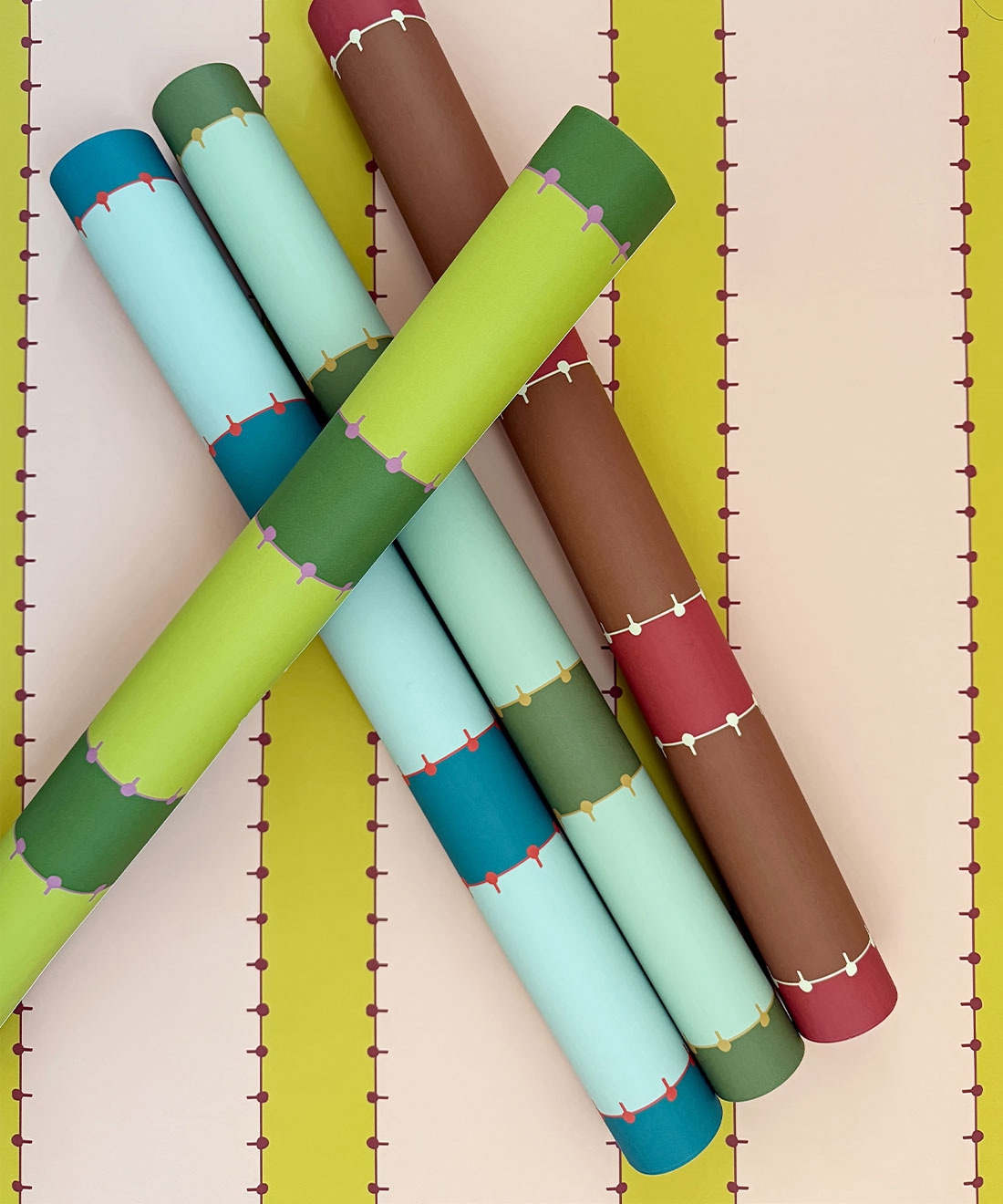
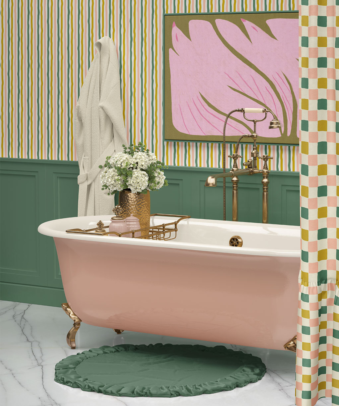
Chelcie: I love the Pati stripe in the pink and green (Citron)
Gray: In the Pati, I love the red and brown (Cinammon). It’s such a vibe!
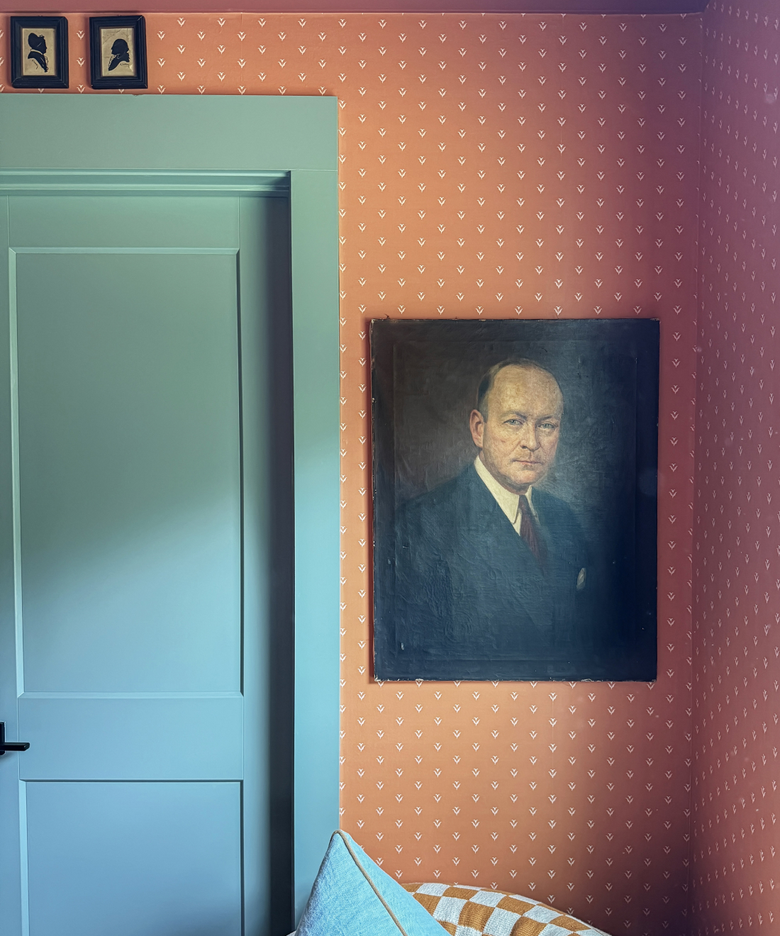
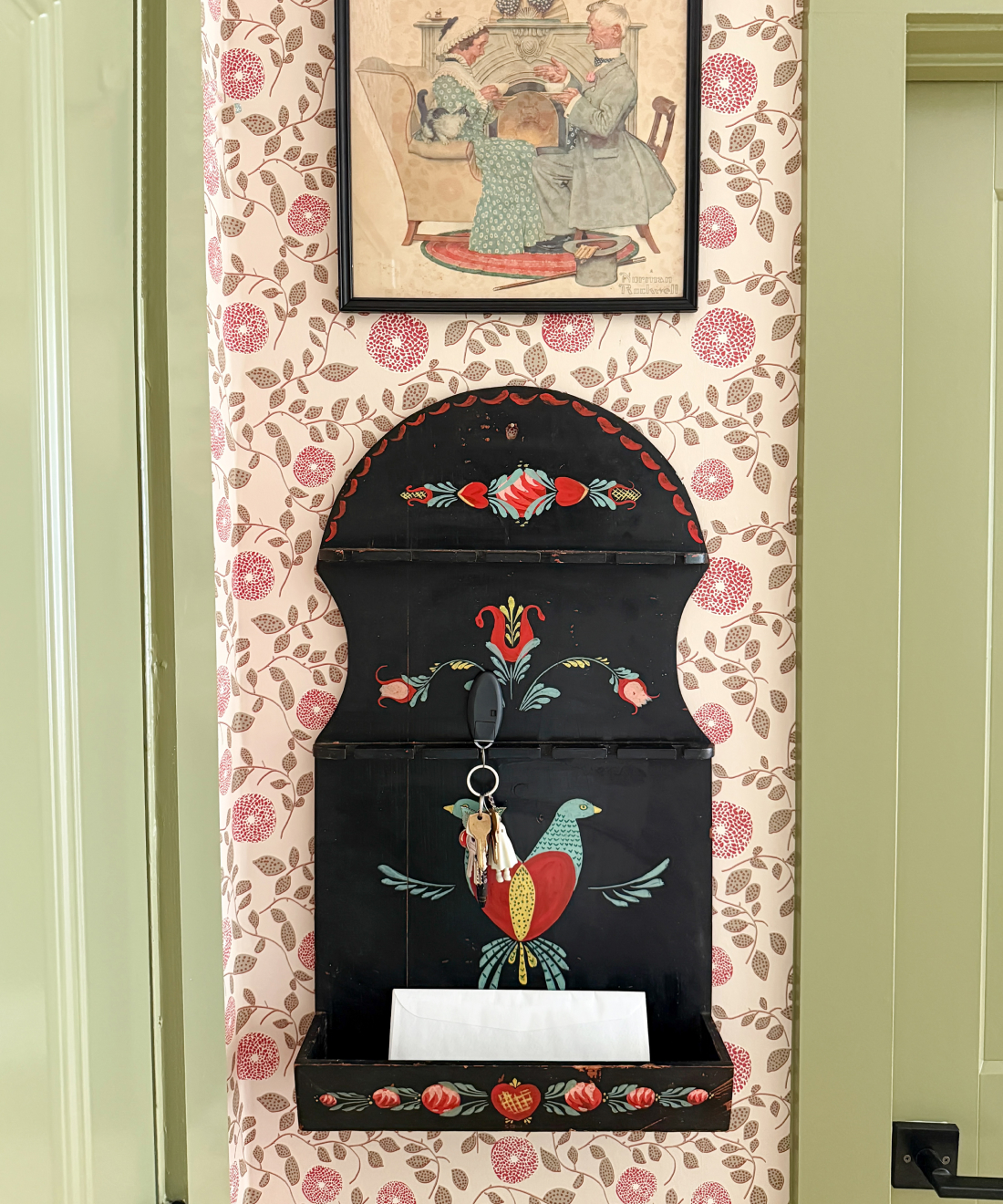
Gray: Aside from the Pati stripe, I think my favorite is Nana’s Kitchen. I love that one because I love to put art all over my walls and I feel like that is very conducive to hanging art on top of it. It’s a smaller pattern but it feels almost like a solid. I think my favorite is the Auburn color (Auburn and Ivory). I have that upstairs in the bedroom. It’s just the right amount of weird. It’s moody and cozy and it’s a great backdrop for art.
9. What’s one design fad you’re loving right now, and one you’re ready to see gone?
Chelcie: Trends in general we just don’t like. If it’s a trend and you can tell it’s a trend, it’s just going to be something we don’t like. Trends they do come and go. Take what you want from them, but don’t make them into your whole identity because they are going away.
Gray: Following a trend implies you’re doing something because you think it’s cool or in style and it’s not because it feels like you, like an expression of yourself. So that’s why I don’t really pay attention to them because it kind of goes against everything I believe in for design.
10. Lastly, what’s one small design risk you think everyone should take in their space?
Chelcie: Don’t go small. People always go, what’s a way you can tiptoe into something. I would say do a cannonball. You don’t really want a half done room. If you want something, you can go for it and not be scared and know you can change it back. If you can do it, you can undo it.
Gray: Wallpaper. Pick a space and wallpaper. Even if it’s just a powder room. That’s such an easy space. It’s not a huge commitment. It’s not a huge expense and it can have a really big impact in a small space.
You also don’t have to do it all at once. It can get expensive and you can take your time and that’s okay. It’s a work in progress.
