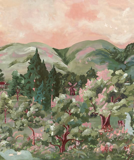
1. Clarify Your Interior Style
Harmony in interior design relies on clarity and confidence. You need to know your aesthetic before you make choices that feel aligned with each other and your home.
For instance, you might want a modern, maximalist space . By pinpointing the era of your contemporary decor (such as mid-century or early 2000s), you instantly narrow your decision choices down to a more focused pool, ensuring that you’re sticking to one clear vision.
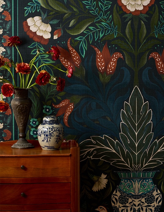
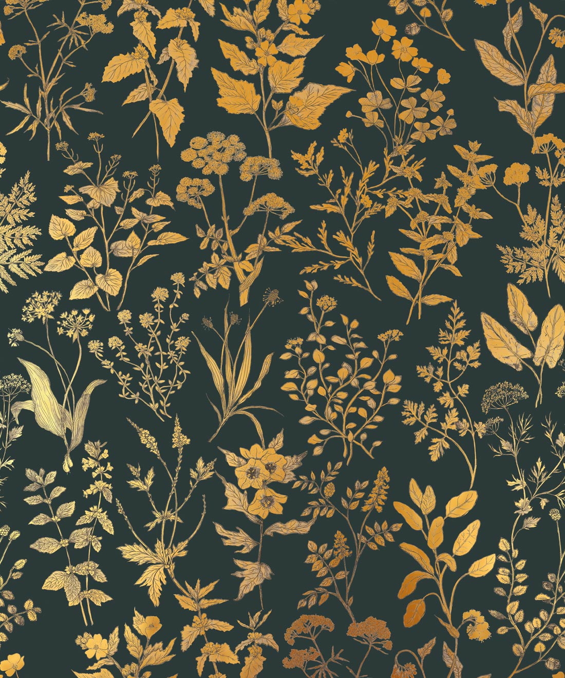
Summer Garden Wallpaper photo courtesy of Mallory Brame
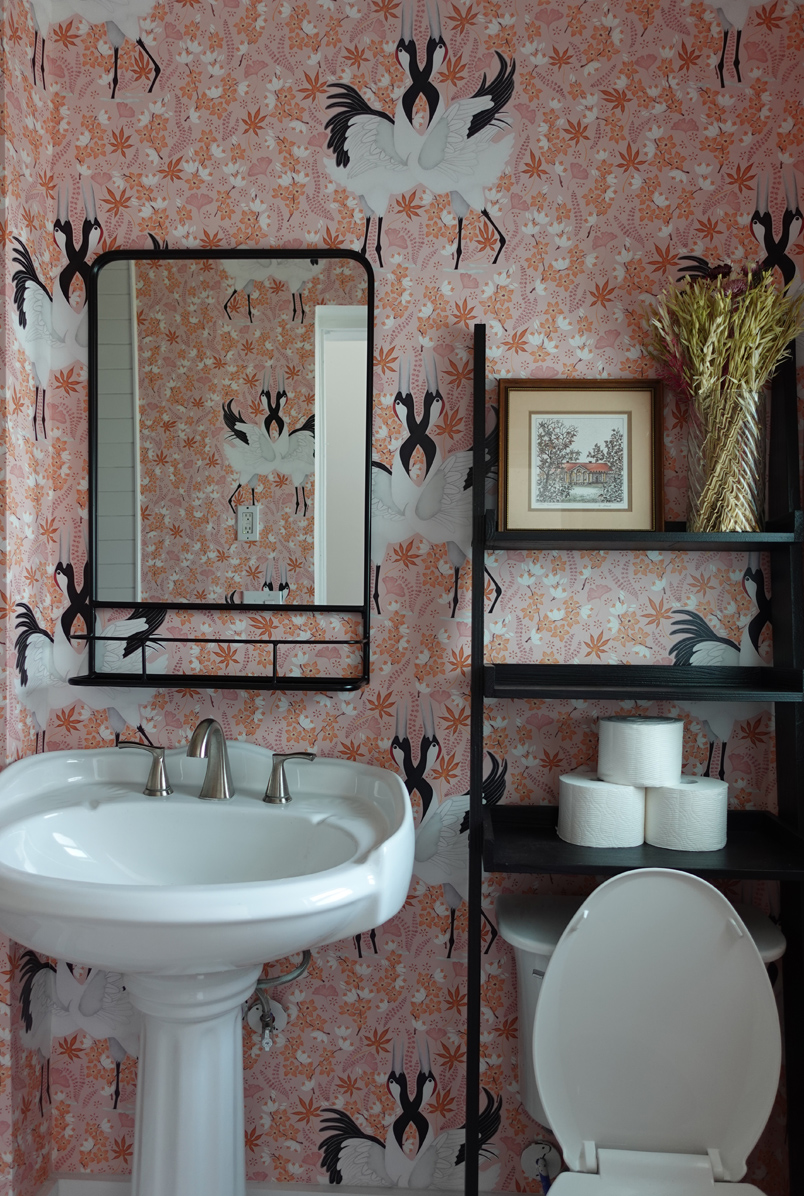
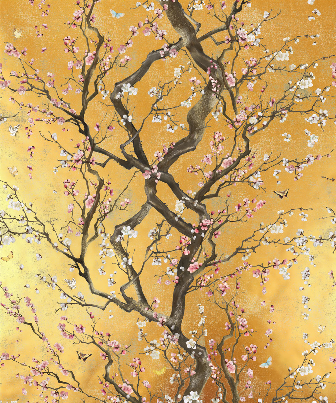
Japanese Cranes Wallpaper photo courtesy of Tiffany Toh
When clarifying your style, we recommend using visual moodboards. Online platforms like Pinterest or Cosmos are a fantastic way to collate digital inspiration. Split collections into categories, such as colours, wallpapers, and window finishes, to organise your moodboard and your mind.
For a more traditional form of interior inspiration, turn to decor magazines. Choose yours based on preferred aesthetics, such as cottagecore or Scandinavian interiors. If you’re not certain of your style, gather a variety of magazines to explore until you find the looks you love.
Source: Hillarys Blinds
2. Start With Your Wallpaper
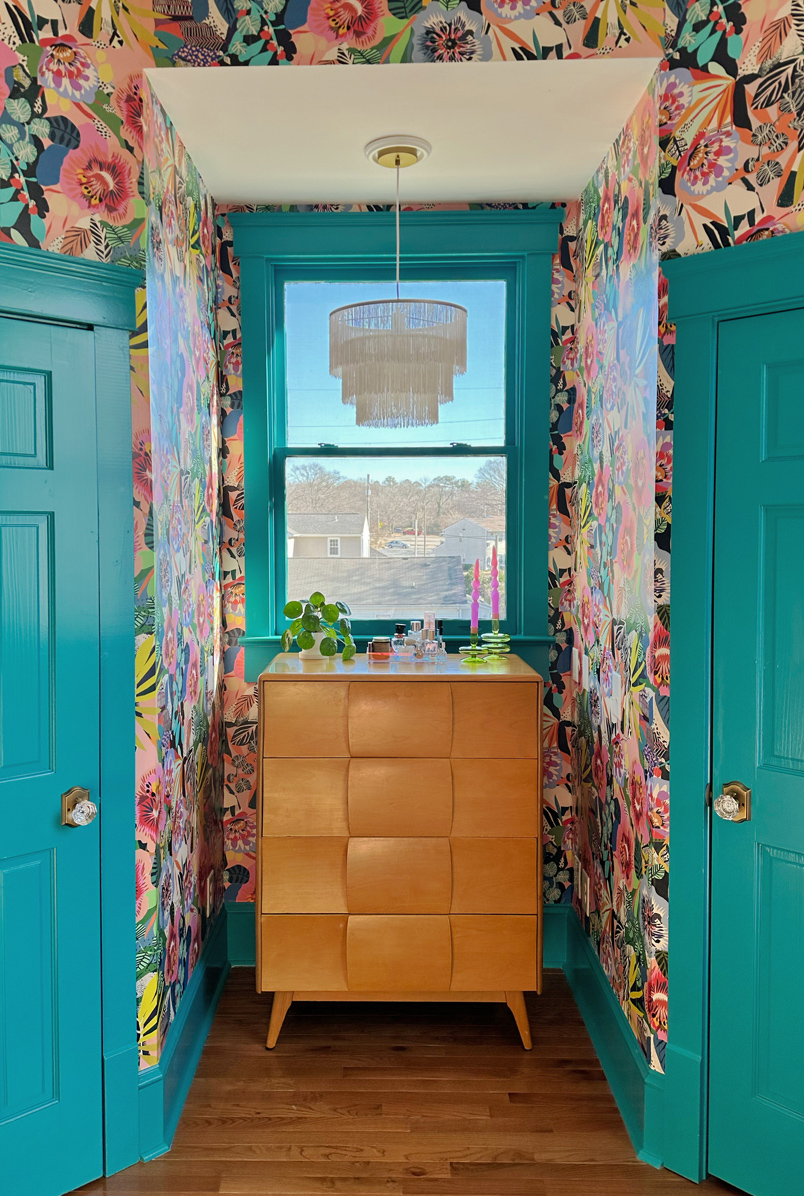
Your walls lead the colour palette in your home and provide a backdrop for the rest of your decor. Even with clashing styles in your space, if it all feeds into the same palette, it feels cohesive.
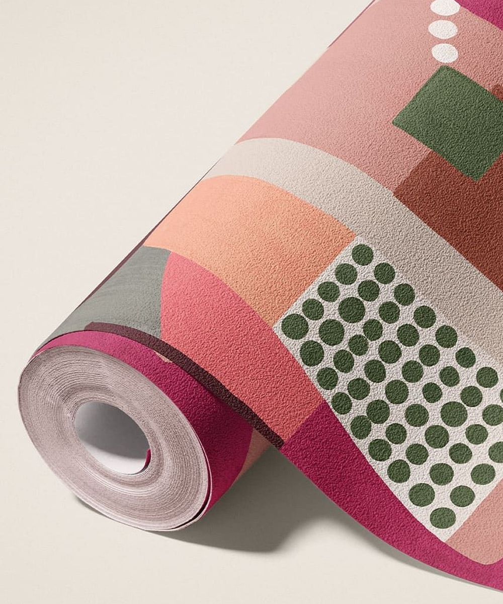
This is why it’s so crucial to look at the individual tones in your wallpaper. These are the colours you’ll use across the rest of your space, and it’s vital you like them as individual hues that go beyond your wallpaper choice.
For instance, if you choose Pavilion Grasscloth Mural in Topaz from the Rich Traditions collection, you’ll have a bold palette of blues, reds, and greens, with subtle hues of cream and pink.
If you’re not certain about colours, we highly recommend ordering a few of our Wallpaper Samples to test different tones, textures, and patterns in your property.
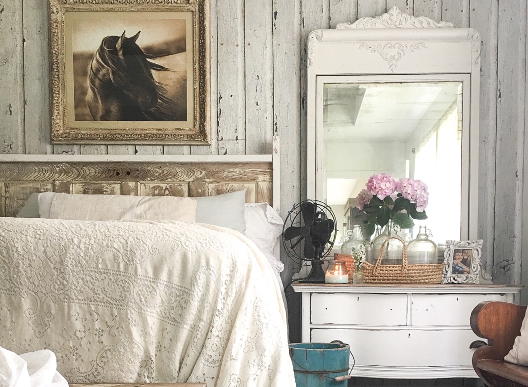
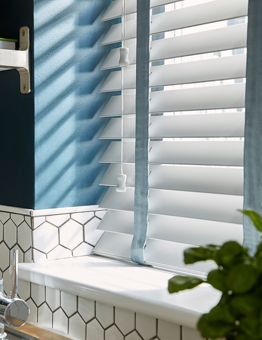
3. Choose Complimentary Blinds or Curtains
Window dressing should complement the wallpaper rather than compete with it, creating a unified visual flow.
If you’ve opted for a bold, patterned wallpaper, consider pulling a colour directly from it for your blinds or curtains. This creates harmony and balance, ensuring that each element of your room works together for that important intentionality.
If you’re working with a single-toned wallpaper, choose complementary colours that align with the overall warm or cool tone of your wallpaper. You could also colour-match your wallpaper to your curtains or blinds if you’re going for the colour-drench aesthetic.
Remember, too, that materials can influence the light and colour in your space. A sheer orange blind, for instance, may cast a warm, orange hue onto your wallpaper when the sun shines through it.
Yvonne Keal, Product Management at Hillarys suggests, “Try comparing your curtain or blind samples against your chosen wallpaper in both natural and artificial light. Live with the samples for a few days, watching how the tones complement and contrast depending on where the light is.”
Source: Hillarys Blinds
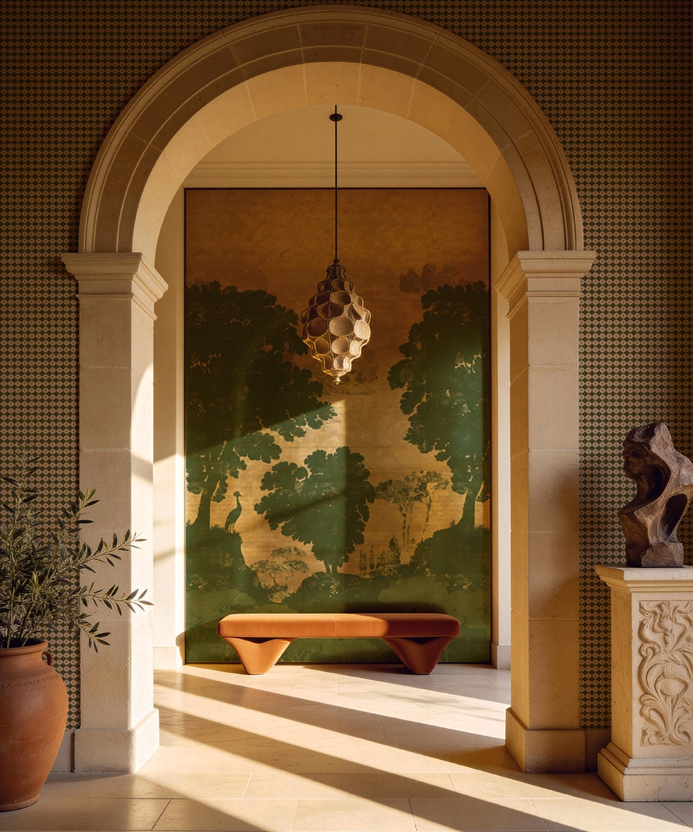
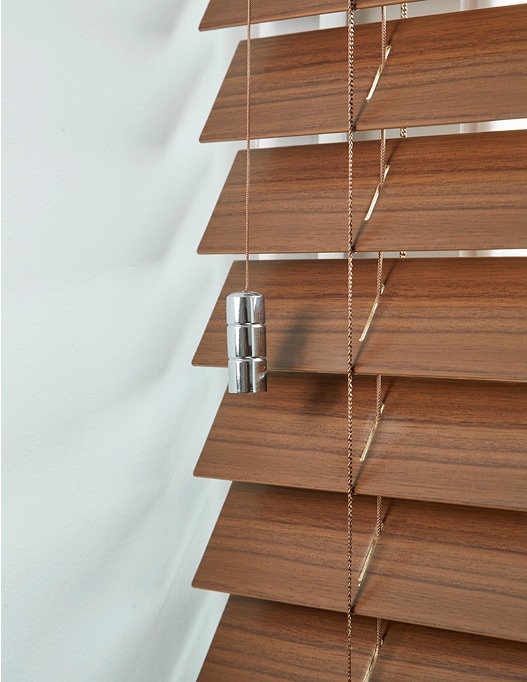
4. Consider Your Textures
Texture brings depth and life to an interior. It can feel luxurious and traditional or fun and modern, depending on how you use it, and elevate your design choices for a high-end finish.
For an interior design statement, explore our textured Grasscloth and Decorative Textile wallpaper collections. Intricate patterns are printed onto natural textiles that enhance your walls with a subtle texture that mimics nature.
These pair well with Hillarys made-to-measure wooden blinds, bringing a gentle contrast to your windows and walls. Lightweight, natural fabrics – like linen – are another excellent choice for softer rooms designed with intention.
5. Blend Minimalism and Maximalism
Combining the restraint of minimalism with the expressive nature of maximalism brings an abundance of visual interest to interiors. This is all about finding the right balance between the two.
For example, if you’ve opted for richly designed, textured wallpaper, keep your window dressings minimal. Clean lines and a muted palette allow your walls to remain the focal point while keeping clutter at bay.
If your window dressings are the focal point, pair them with more minimal wallpaper to create a sophisticated contrast. The Euro Summer Dreams collection, for instance, brings sun-washed palettes and minimal designs that provide the perfect backdrop for focal windows.
Contrast and scale play a significant role in achieving harmony. Our larger-scale patterns make a powerful, confident statement when paired with gentle textures at the window. Think sheer linens, finely woven blinds, and tonal fabrics that echo your wallpaper style rather than compete.
Conversely, smaller, repeating wallpaper patterns create an elegant canvas for a more dramatic curtain or blind, guiding the eye and establishing a clear focal point.
6. Paint Your Doors and Skirting Boards
Interior wall design also incorporates doors and skirting boards. These little finishes can anchor the room and tie your existing choices together for a seamless, intentional flow.
You might, for instance, pull a shade from your wallpaper or blinds to paint your skirting boards. This creates continuity around your room, and subtly guides the eye from one surface to the next.
On the other hand, a contrasting colour brings confidence to your interiors. It’s bold and playful, framing your walls and windows with colour. If you want to lean into maximalism, this is definitely a look to explore.
7. Focus on Trims, Frames, and Finishes
Refine your aesthetic with finishing touches to your windows.
Trims, window frames, curtain rods, and hardware finishes play a powerful role in bringing your look together. When purposefully chosen, they can reinforce the tones and mood of your walls, blinds, and curtains, creating cohesion in every corner of your space.
Aged brass, for instance, brings warmth that complements wallpapers with rich, earthy tones. Take a look at metallic wallpaper and pair with deep, dark wood – this contrasts perfectly while complementing both deep and light hues.
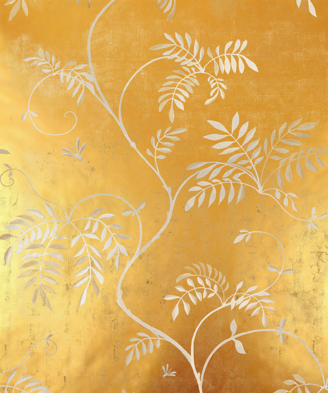
For a more contemporary style, explore bright golds and silvers. These finishes work especially well with minimal wallpapers, and can be used across your home, from curtain rings to light fittings and door handles.
Final Thoughts
The impact of conscious interior wall design shouldn’t be underestimated. From the wallpaper textures you choose to the colour of your skirting boards, every choice comes together to create the aesthetic of your home.
Looking for more interior design inspiration? Check out the latest on Ampersand, the Milton & King blog for wallpaper enthusiasts.